During the fall 2022 semester of NYU, I took a design class called "making virtual sense" with Carl Skelton. For my final project, I branded a parody restaurant called Le Bouche. The restaurant was based off of the Rainforest Cafe, with themes of the jungle running through it, but is ultimately commentary on what people will consume when branded correctly. The branding was done to look like a high end restaurant you might really find in Hudson Yards, but once you look deeper it is actually a quite horrible restaurant- A place one should never want to go.
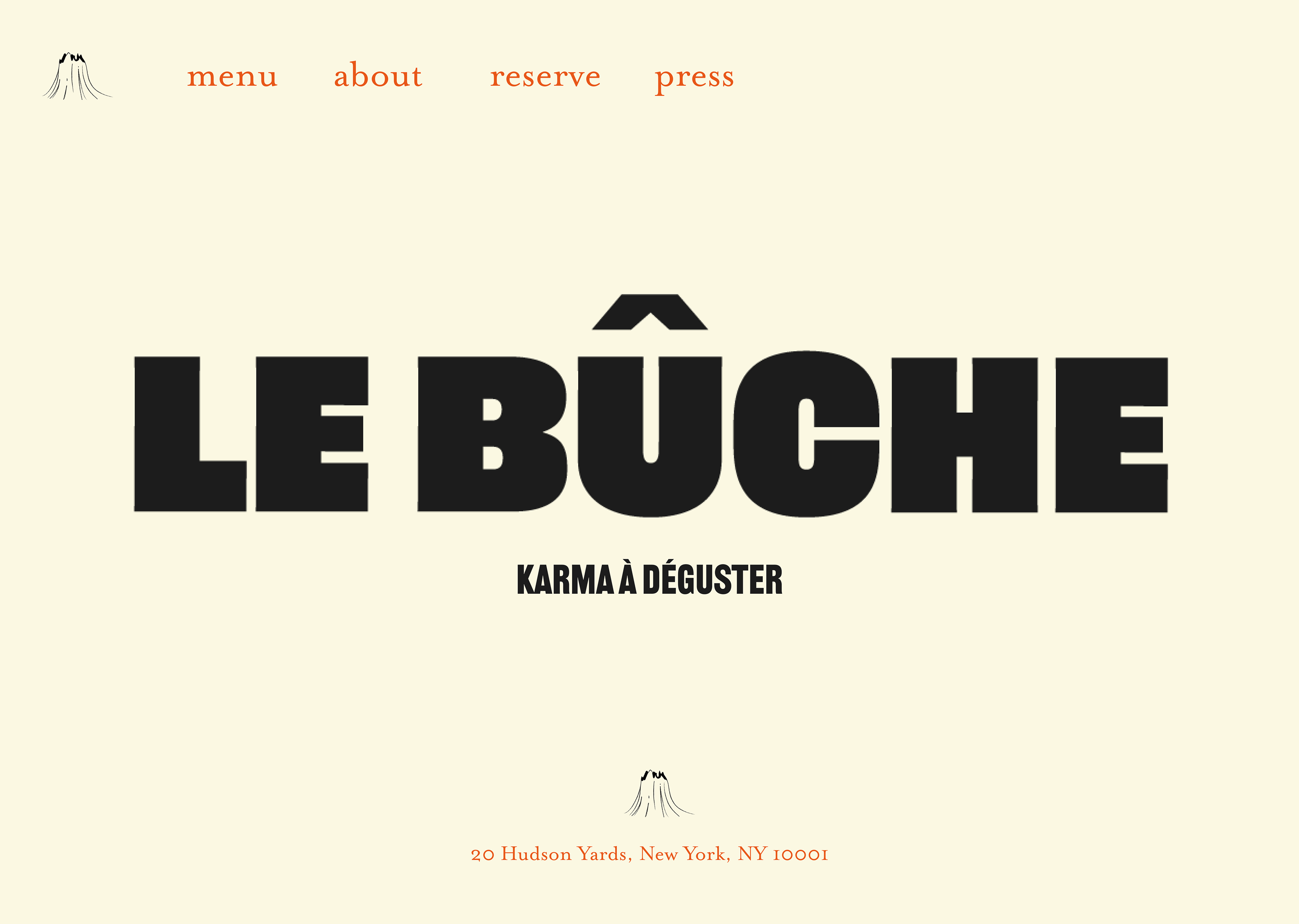
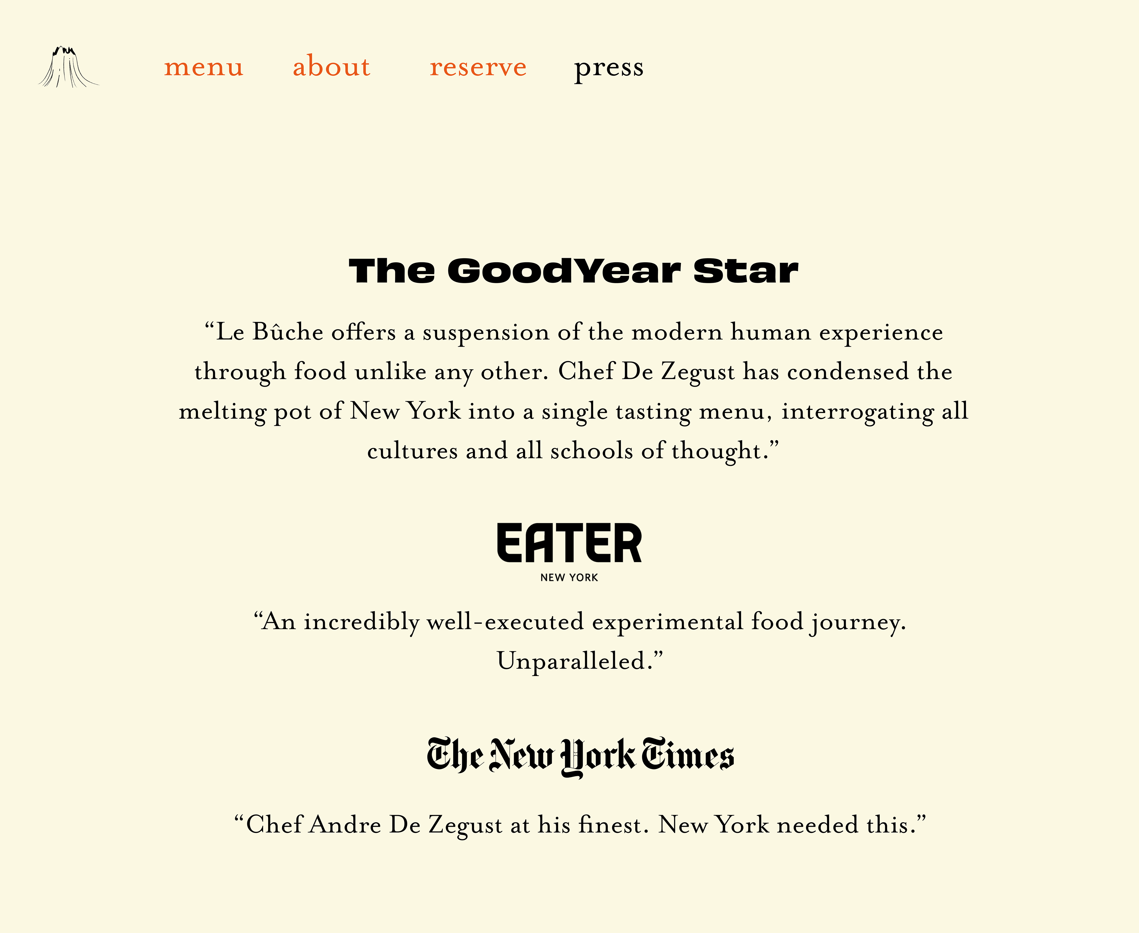
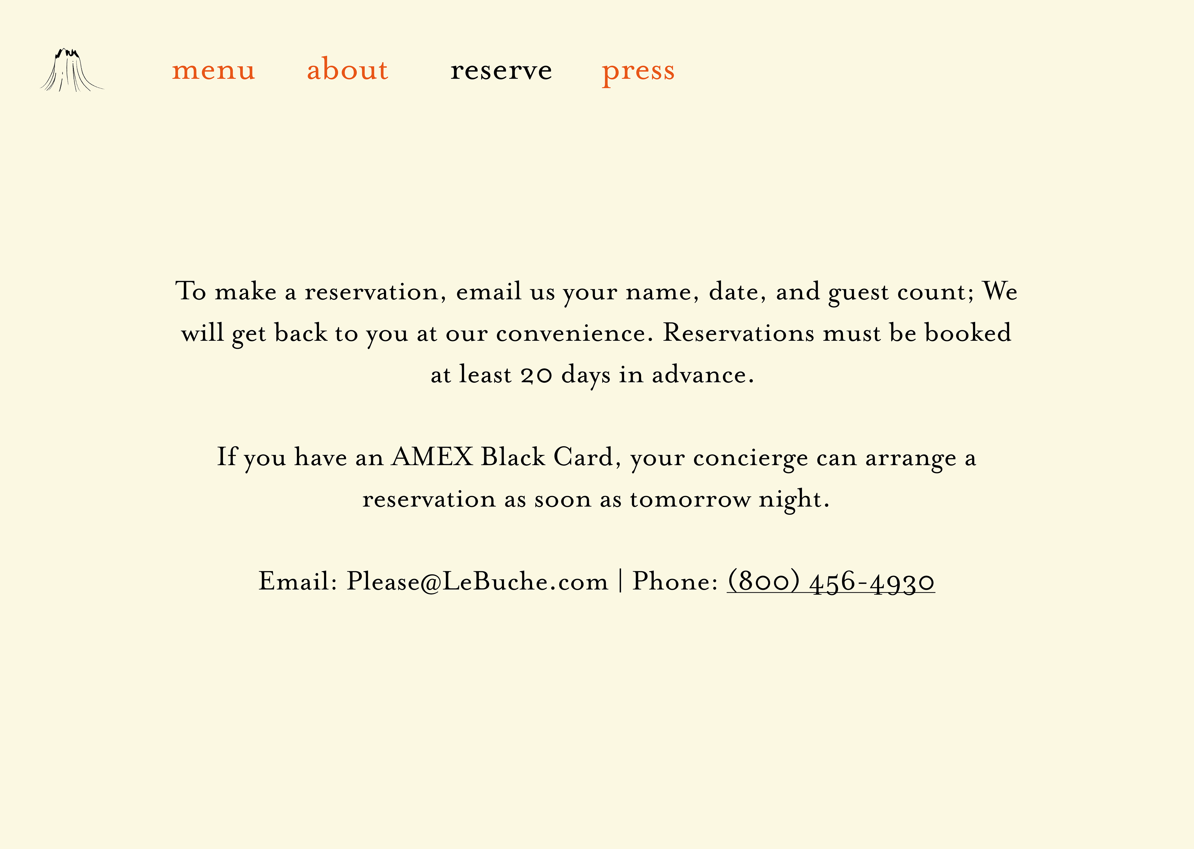
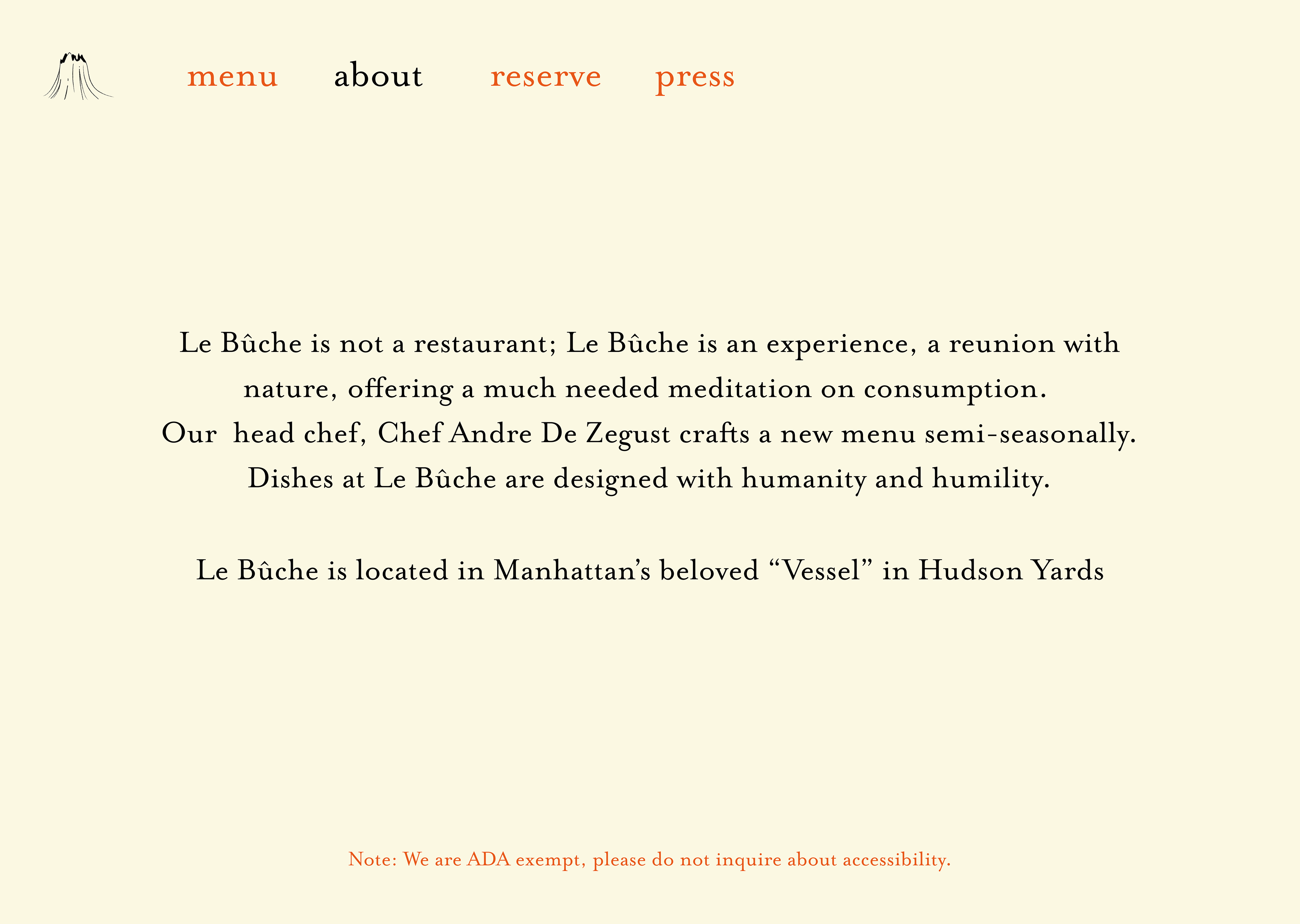
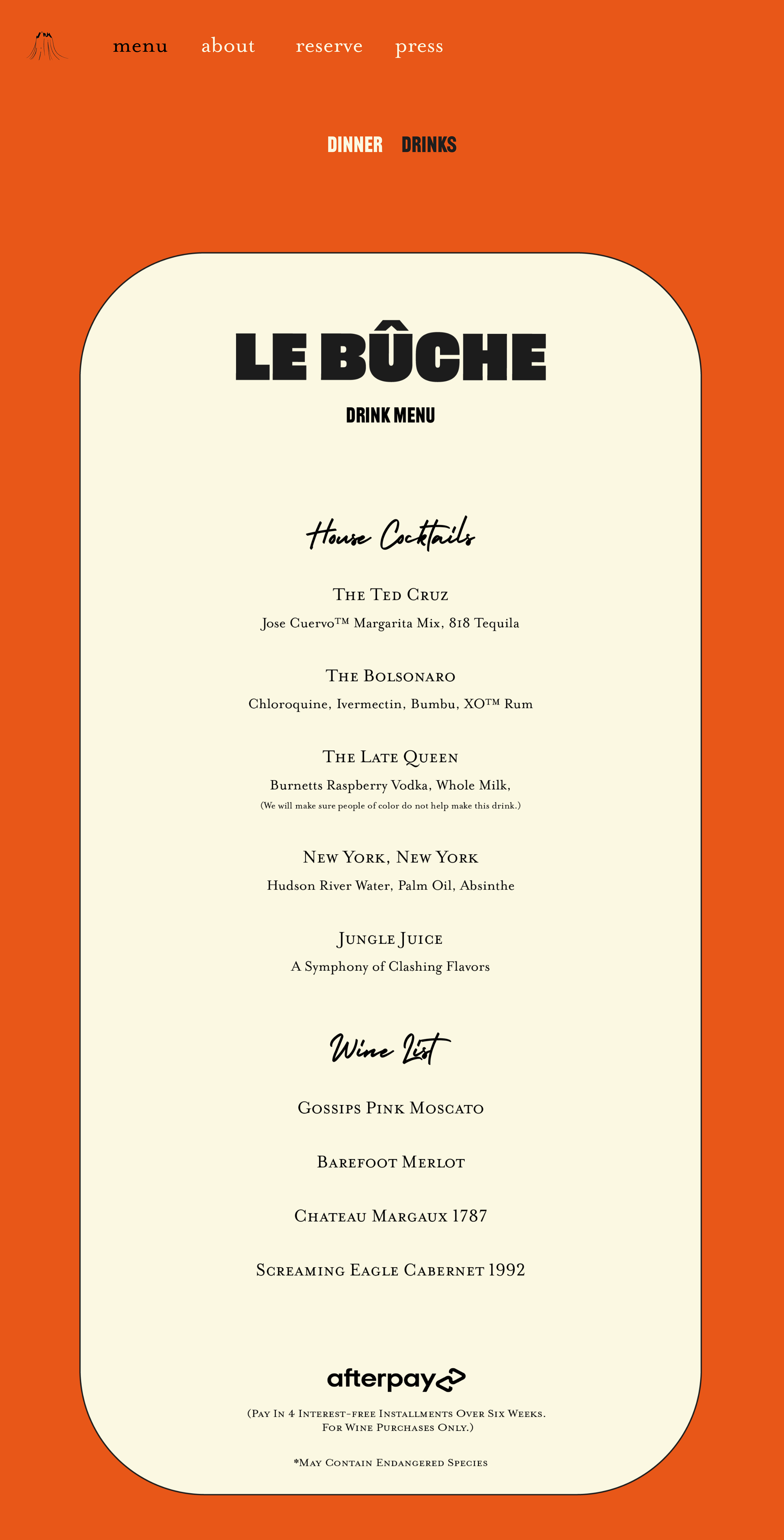
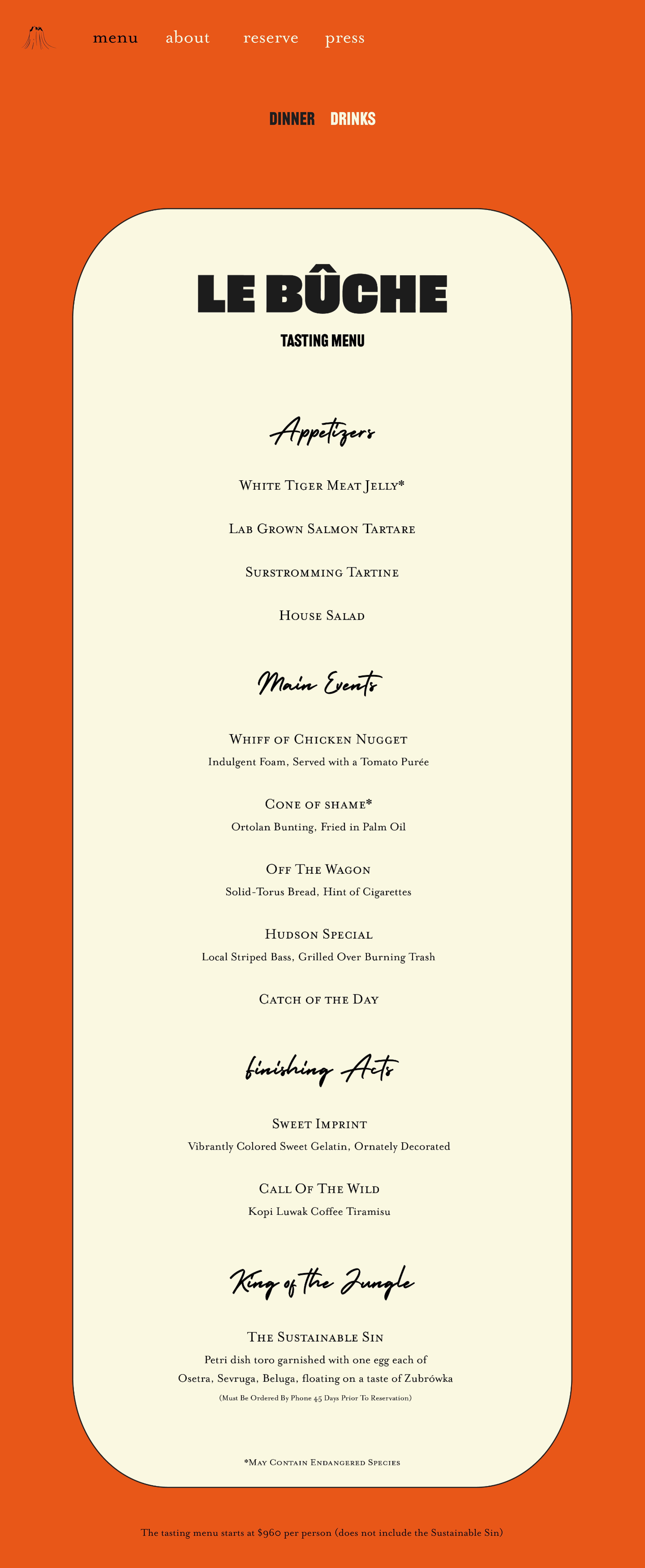
These are the pages of the website prototype I created in Figma. I chose these typefaces (Railroad ATF and Mrs. Eaves) to evoke 60s and 70s French poster design as the restaurant is playing off of the commonly-assumed high status of French concepts.
I settled on this 3 color-scheme to give the restaurant a vintage feel and provide it some sort of perceived history. The three colors red, white, and black were the first three to be readily available for the Gutenberg printing press, and the three colors together signal that same antiquity today.
The logo I created, the tree stump seen on the home page, is an homage to the devastating effects of climate change that late-capitalism has brought about, as capitalism and consumerism are inextricably linked.
